Shift the Filter
I have previously written about filters when talking about signals in control engineering. To avoid reacting to a noisy signal, you take the average over a period of time, to allow the noise to cancel itself out. The resulting trend is smoother and represents the real trend.
I noticed another clear example when looking at the COVID-19 deaths as reported by the UK government.
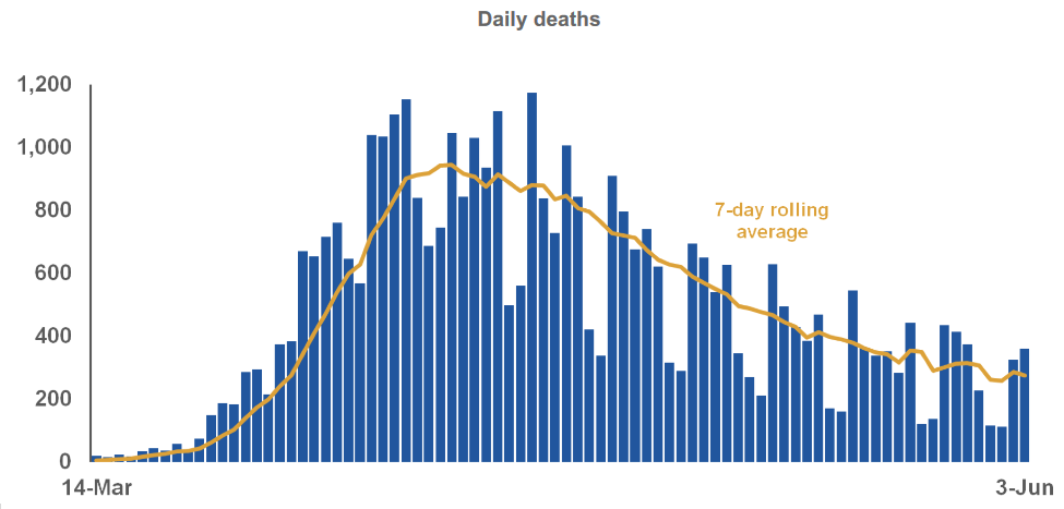
The graph shows the number of deaths reported each day as well as a trend of the rolling seven day average. As I mentioned in my previous post, the drawback of using a filter is that it adds a lag to the result and this can be seen in the graph. When the number of deaths is rising sharply at the start, the trend lags behind all the daily figures. Similarly, as the cases have been decreasing, the trend looks worse than the daily figures (though in this case, it is less obvious because the daily figures jump around depending on the day of the week).
There is not much you can do about this lag when trying to control a process. You need to have a value to respond to and you can’t look into the future, so you have to accept the lag. However when looking at a trend, you could shift the result. Rather than looking at the average over the last seven days, you take the average of today, the three days on either side. This means that the trend doesn’t stop on the last day you have data, but three days earlier.
I have tried to recreate the graph using the government’s data below.
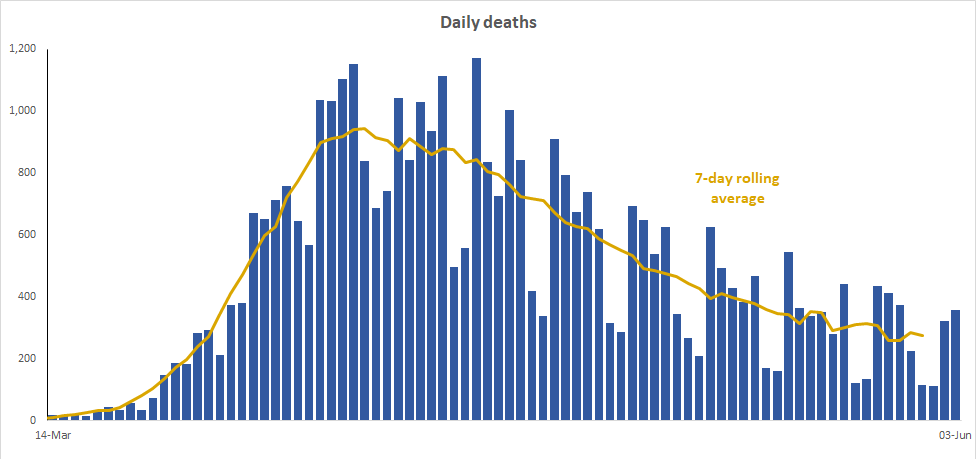
This time the trend rises with the daily figures. I believe this shifted figure is better because it also allows you to clearly see when the peak of the cases was. The fact that the line ends short also emphasises that the trend line uses lagged data and is not completely up-to-date.
I like the idea of shifting the filter over so that it reflects the true date that the data refers to. I can also see why using the rolling average as normal is also simpler and why it may be used. I just thought that it was a good example of the lag that is generated by a filter and also asking if there is anything that can be done to overcome it in this case.
The original graph and data was obtained from the Slides and datasets to accompany coronavirus press conference: 3 June